Thursday, 13 December 2007
I discovered this work by Preston Blair, Basic Phonemes shows in detail the realistic mouth movements. This will help me a great deal when animating my characters talking.
Animating speech can be one of the most difficult tasks in animation; the process of matching the mouth-movements of your animation to the phonemes of your audio track is most commonly known as lip-syncing. For a quick fix, it's no problem to just animate the mouth opening and closing, and it's a simple shortcut, especially when animating for the web. But if you want to add actual expression and realistic mouth-movements, it helps to study how the shape of the mouth changes with each sound. There are dozens upon dozens of variations, but my sketches are renderings from the basic ten shapes of the Preston Blair phoneme series. (They're also an example of what happens when Adri dashes off ten-minute sketches from memory rather than detailed artwork.)
These ten basic phoneme shapes can match almost any sound of speech, in varying degrees of expression--and with the in-between frames moving from one to the other, are remarkably accurate.
You may want to keep this for reference.
A and I: For the A and I vowel sounds, the lips are generally pulled a bit wider, teeth open, tongue visible and flat against the floor of the mouth.
E: The E phoneme is similar to the A and I, but the lips are stretched a bit wider, the corners uplifted more, and the mouth and teeth closed a bit more.
U: For the U sound, the lips are pursed outwards, drawn into a pucker but still somewhat open; the teeth open, and the tongue somewhat lifted.
O: Again the mouth is drawn to a pucker, but the lips don't purse outwards, and the mouth is rounder, the tongue flat against the floor of the mouth.
C, D, G, K, N, R, S, Th, Y, and Z: Long list, wasn't it? This configuration pretty much covers all the major hard consonants: lips mostly closed, stretched wide, teeth closed or nearly closed.
F and V: Mouth at about standard width, but teeth pressed down into the lower lip. At times there can be variations closer to the D/Th configuration.
L: The mouth is open and stretched apart much like the A/I configuration, but
M, B, and P: These sounds are made with the lips pressed together; it's the duration that matters. "M" is a long hold, "mmm"; "B" is a shorter hold then part, almost a "buh" sound; P is a quick hold, puff of air.
W and Q: These two sounds purse the mouth the most, almost closing it over the teeth, with just the bottoms of the upper teeth visible, sometimes not even that. Think of a "rosebud mouth".
Rest Position: Think of this as the "slack" position, when the mouth is at rest--only with the thread of drool distinctly absent.
When you're drawing or modeling your animation, by listening to each word and the syllable combinations inherent you can usually break them down into a variation of these ten phoneme sets. Note that my drawings aren't perfectly symmetrical; that wasn't just shoddy sketching. No two people express themselves in an identical fashion, and each has individual facial quirks that make their speech and expressions asymmetrical.
Wednesday, 12 December 2007
Tuesday, 11 December 2007
Music video animation
This isn't the original music-video to 'Yellow' by coldplay, i couldn't find the release date and to be honest i have no idea whether or not this movie is legit but i do know that it works well with the song and would be easily made in flash. i like the clean cut style of animation and plan to create a similar style when developing my short animation.
Flash animation
Doesn't it seem like the simplist ideas are often the most effective. When i deceided to create my animation in flash i thought i best start researching what other have made using the program. This was the first animation i came across on youtube, i had actually seen this originally about a year and half ago and was still impressed with this idea when stumbled upon this the other day.
Monday, 3 December 2007
2020 Holographic advertisement
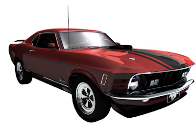
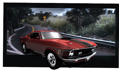
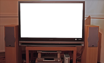
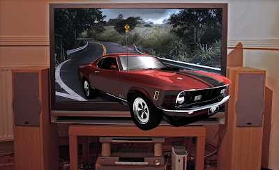
Here is my final piece for the 2020 brief, it shows a 3D holographic projection of a car emerging out of a television screen. I took a picture of the TV screen however the picture of the mustang was taken from infinitee-designs.com and was created by Ralph Manis in 2004 and the image in the background was taken from deviant art entitled, 'On the road of life,' by Mashuto. I manipulated the images to portray the idea that the mustang was created using a 3D holographic projector. Had this brief been worth more credits i would have created all the imagery myself, however i didn't want to cut myself short and end up rushing to get the brief finished besides i feel this imagery portrays the concept perfectly... Thank god for image manipulation!!
2020 The step by step production
First i took the image of the Mustang and cut around it using the lasso
tool, i then deleted the background and smoothed the edges.
Overlaying the Mustang over the image of the road i scaled it to
proportion, after doing this i burned the road to add shade and blend
the road around the car.
Taking the photograph of the TV, i cut out the screen and smoothed off
the edges.
By layering the road image behind this photograph and placing the
Mustang image above it, my idea was beginning to take shape.
2020 The step by step production part 2
By creating a lighter layer around the part of the car that
would be made up by the holographic projection it made the
holograph look more realistic.
Adding a black border around the majority of the photograph of
the TV placed the main focal point of the image in the center,
towards what is actually being advertised.
I placed the main text at the top of the image, the name of the
product; 3DCQ (3-Dimensional cinema quality) holographic projector.
Finally at the bottom of the image i put a bit more information
about the product so potential customers would know what it is.
Subscribe to:
Posts (Atom)