Tuesday, 29 January 2008
Animation Evaluation
There are a few things with this animation that I am not completely satisfied with. Had I managed my time better I would have focused my attention on the movement of the characters, as it is through body language, the most effective way of portraying emotion. Viewing my animation after completion it is clear to see that the characters are both very static, without the voice-overs that I made for both characters it is much more difficult to defy the emotions that each character is trying to convey.
Having said this it is obvious when listening to the sound as well as watching the animation the emotions each character is trying to display: scary (snake) and terrified (tortoise.) I am impressed with how the lip-syncing came out. There are only the odd couple of frames where it is slightly out of time, this is down to the speed in which the voice-overs were recorded causing problems with key frame spacing in Flash. The line drawings although simple, look professional due to their development in illustrator. The backgrounds that I designed give the piece a nice finish and were quickly and easily created in Photoshop.
Unfortunately, looking back on the brief and the outcome requirements I think that my animation was a bit miss-directed. I spent far too much time trying to create realistic looking cartoon characters and although it has a professional animated feel, the overall piece is let down by the lack of movement. If I were to do this project again I would have made a 3-Dimensional animation using Maya. I regret using Flash, although it gave me a nice quality finish and was easy to import sound, I was let down by my expectations of the capability of motion tweening. This was the only part of production that didn’t go according to plan resulting in the time consuming task of drawing each individual movement out in Illustrator.
Monday, 28 January 2008
Final Crit
Thursday, 24 January 2008
PPD Exporting Illustrator layouts to Flash, What's new?
This article found once again in the Digital Arts magazine, suggests that since Flash has become part of the Adobe package with the release of CS3 that exporting illustrator files to Flash has been made much simpler. I'm sorry but I beg to differ, I've been using CS2 and Proffessional 8 for over two years now constantly dropping illustrations i have made into Flash and I've never had any difficulty doing so. This three page article is absolute rubbish, I can't help but wonder why it was written. So to answer my own question not a lot is new, well if there is added features they didn't publish them.
Wednesday, 23 January 2008
Website; Image Development
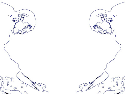
I took the outline I had used for the magazine imagery and duplicated it putting them back 2 back and upside down. In all honesty i wasn't actually trying to create this but i actually ended up with a nice kaliedascopic pattern which i find very pleasing on the eye. I think it's quite an interesting style, it's something i haven't come across much but i plan to research it and try it out with images i have taken.


PPD How safe is your Design
This is a double page spread i found suggesting different ways in which you can protect your work, most of them are fairly obvious like images you put on the web making sure they're 72dpi watermarking and adding metadata to Photoshop and Illustrator files. But who in the class actually does it? I know i will be more careful when protecting my work from now.
Tuesday, 22 January 2008
PPD The worlds smallest HD camera
Has anyone seen images taken by the Iconix HD-RH1, the smallest HD camera ever made it's the size of a golf ball and weighs in at just two ounces. Its footage is supposed to featured in the CBBC series smalltalk diaries, can't say i'll be watching it. Anyway I came across this aricle at the front of Digital Arts magazine and was most impressed with some of the images shown. It displays close up images of insects in so much detail i couldn't believe my eyes.
Seeing this article reminded me of when i was a kid, looking at some old black and white photographs of my grandparents and comparing them to some pictures i had taken using a standard polaroid. I couldn't help but ask my dad how long will it be until photograph quality is better than our eyes, to which he replied. "that will never happen because if they're better quality than our eyes we wouldn't be able to tell."
Well i challenge you to see something that small in that much detail!
Monday, 21 January 2008
The Life of Larry by Seth Mcfarlen
Seth Mcfarlen is my favourite animator, i got my inspiration from such adult cartoons as Family Guy and American Dad. It's the clean cut line drawings i find most impressive and makes me want to recreate a similar style. Here's some of his early work, in which he has created an old fashioned vibe to the film and animation, the whit remains the same however.
Magazine; Image Development
Magazine; Image Development
Sunday, 20 January 2008
Magazine; Image Development
I wanted to find the colours that worked best with this image, it was taken in black and white with a digital SLR. To make the image stand out more i decided to make it Duotone, this is the process i used for selecting the best colour for the job. This is quite an important stage in my magazine development as it will determine the colour scheme for my double page spread.


Monday, 14 January 2008
Communication Design for Print and Digital Media-Website structure
Magazine; Collecting Images


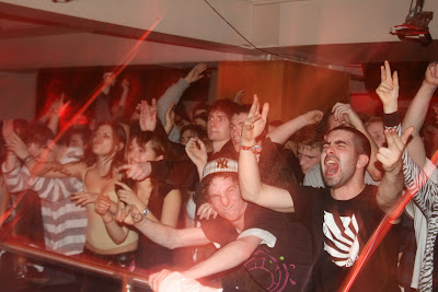
In these first couple of images i was experimenting with a technique my photography teacher taught me when i was in ND Graphics, it involves zooming in and out whilst the lens is open. It's quite difficult to get the hang of and the results are often unexpected. For the last two i stuck to conventional point and shoot methods from which i got some quality once in a life time images of the crowd.
Magazine; Collecting Images
Magazine; Collecting Images
I love taking photographs in clubs, the long exposure time due to the lack of light causes the main focus of the image to come out fine whilst all round it has a sort of light pollution which tends to blend in to the image i find this helps capture the atmosphere like nothing else i have photographed.


Tuesday, 8 January 2008
Monday, 7 January 2008
Website layouts
Subscribe to:
Comments (Atom)


