Wednesday, 27 February 2008
Monday, 25 February 2008
Tuesday, 19 February 2008
National Museum of Photography Film and Television
Regretfully I didn't take a camera with me to the museum however i did manage to track down some image on the BBC website of the film cameras the BBC uses in television, from this vintage one at the top, through the 1970's to one used nowadays which can be controlled yourself. It was actually much simpler than I had previously expected. At the Bottom is an autocue, set up in front of a news desk with a camera filming you as if you were presenting the news. I couldn't help but have a go.
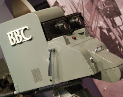
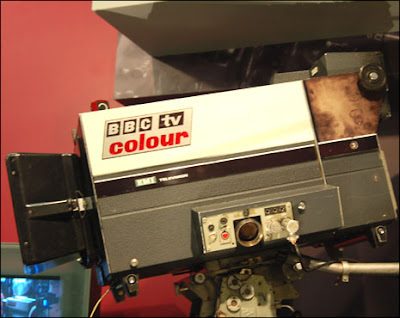
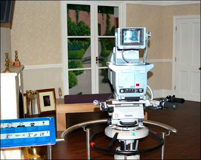
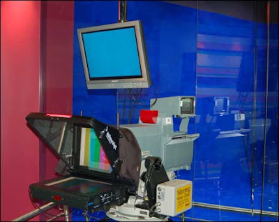


National Museum of Photography Film and Television
I went on a course organized trip to the National Photography, Film and Television museum today, this was quite an experience and important in the course as it gave an insight into our final module for this year, Film and video editing. Amongst other things I learned about techniques in how television is Filmed and broadcast, the development of technology in moving image over the last century and a half. I also spent some time learning techniques of conventional methods within animation and how in the digital era many of the processes are very similar.
After spending a short amount of time viewing the development of photographic film, I watched a short 3D film on Dinosaurs in the Imax, this was the most impressive part of the day for me as i have not previously seen a 3D film. However after recently designing a poster for the 2020 brief on the 3D home entertainment for cinematic holographics, i couldn't help but wonder how long it would be until it is possible to view a film in 3D without the irritation of glasses. After all the technology for 3D film is fifty five years old and is rather primitive in terms of how technology in film and television has developed.
I had just enough time at the end to view a first series episode of the League of Gentleman in the TV Heaven area before it was time to leave. In all it was an interesting day out, educational and informative. Unfortunately they're were i few displays that were broken and there was a whole floor which was currently undergoing construction.
Tuesday, 5 February 2008
Evaluation;
Communication Design for Print and Digital Media
The final magazine layout I produced had the desired effect, I wanted to design a double page spread with an underground club style. I feel the finished piece was a vast improvement from the design I displayed for the final critical analysis just one week earlier. Some simple image manipulation in Photoshop and illustrator helped me blend the photographs I took in to the double page spread. Using text wrap’s in Indesign I was able to situate the body text around the images nicely giving an overall professional look to the magazine layout. I’m a big fan of the stressed, sketchy font I used for the title and would have liked to use it throughout however this causes problem with legibility.
The online article I designed was once again something I am proud of however unlike the magazine I feel this does not look like a realistic site. The problems that are most notable with the website are as follows; a lack of site heading, for example “Dubplate Magazine.” The article title, for example “Who Said Vinyl Is Dead?” Finally I would have liked to give the pages more interesting names than, “home,” “page1” and Page2.”All these things are faults that could be easily put right however my time management let me down in this area. I thought I had a better understanding of the software but found even making the simplest of sites difficult and time consuming. On the other hand I feel the artwork I created for the site worked well and was visually pleasing.
Overall I am pleased with the finished results in both areas, however like with much of my work I felt as though my time management was poor. This meant that there was a lack of research for both magazine and website, ideas were thin on the ground causing the developmental work to be cut short, Finally this resulted in my final pieces been let down. This is something that must be improved as I feel it is starting to affect my overall grade.
Friday, 1 February 2008
Double Page Spread Development
Now it's Just a case of applying the text and playing about with it until it fits nicely. I had previously decided to go with a similar style format for the text in the design I originally created however this had to be altered slightly to fit with the new and developed imagery. Once the text is in place there we have the finished product.


Double Page Spread Development
Double Page Spread Development
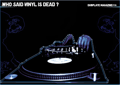
Because i had created this imagery in Photoshop and placed the whole thing on along with the black background into Indesign I wasn't able to create a text wrap around it. In order to do so I had to create an outline around the image using the pen tool. The outline is visble in the image above but won't be when it goes to print.
Double page spread development
Subscribe to:
Comments (Atom)


