Evaluation;
Communication Design for Print and Digital Media
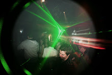
The final magazine layout I produced had the desired effect, I wanted to design a double page spread with an underground club style. I feel the finished piece was a vast improvement from the design I displayed for the final critical analysis just one week earlier. Some simple image manipulation in Photoshop and illustrator helped me blend the photographs I took in to the double page spread. Using text wrap’s in Indesign I was able to situate the body text around the images nicely giving an overall professional look to the magazine layout. I’m a big fan of the stressed, sketchy font I used for the title and would have liked to use it throughout however this causes problem with legibility.
The online article I designed was once again something I am proud of however unlike the magazine I feel this does not look like a realistic site. The problems that are most notable with the website are as follows; a lack of site heading, for example “Dubplate Magazine.” The article title, for example “Who Said Vinyl Is Dead?” Finally I would have liked to give the pages more interesting names than, “home,” “page1” and Page2.”All these things are faults that could be easily put right however my time management let me down in this area. I thought I had a better understanding of the software but found even making the simplest of sites difficult and time consuming. On the other hand I feel the artwork I created for the site worked well and was visually pleasing.
Overall I am pleased with the finished results in both areas, however like with much of my work I felt as though my time management was poor. This meant that there was a lack of research for both magazine and website, ideas were thin on the ground causing the developmental work to be cut short, Finally this resulted in my final pieces been let down. This is something that must be improved as I feel it is starting to affect my overall grade.
skip to main |
skip to sidebar
If two heads are better than one... Imagine what we could do with six billion!!!

Blog Archive
-
▼
2008
(138)
-
▼
February
(20)
- How to videos... DJing
- How to videos... DJing
- How to videos... DJing
- How to videos... Ideas
- How to videos... Ideas
- How to videos... Ideas
- How to videos... Ideas
- How to videos... Ideas
- How to videos... Ideas
- How to videos... Ideas
- How to videos... Ideas
- National Museum of Photography Film and Television
- National Museum of Photography Film and Television
- Finshed Double Page Spread
- Evaluation;Communication Design for Print and Digi...
- Double Page Spread Development
- Double Page Spread Development
- Double Page Spread Development
- Double page spread development
- Double page spread development
-
▼
February
(20)
Haydn's Blogspot
- Haydn
- Leeds, Yorkshire, United Kingdom
No comments:
Post a Comment