Overall I am fairly satisfied with how this project was managed and therefore I quite impressed with the final results. Unfortunately due to a prolonged illness I was prevented from finishing the project exactly as I had intended. If I had more time I would have liked to develop some voiceover content as I feel this is the only thing the Ident is lacking. As was often the case with my projects last year it took a while for me to get started, this makes life much more difficult in the long run. After doing this project I have realised that everything runs much smoother when it is well planned out.
If I am to be honest I don’t think I could have created a piece of work much better than this in the allocated time however in future projects I should investigate other ways of creating footage that isn’t so time consuming. I must remember to take screenshots of every stage of my development as I feel that this will be the main thing that lets my mark down. I also spent a lot of time in Maya for this project as I didn’t feel confident enough to create my animation project in it last year. This is the main reason I decided to do the Sci Fi sub brief as I felt I needed some much needed experience in 3D modelling.
I should take encouragement from this piece of work as for the first time on the course I have come across an area I could see myself working in the future. I really enjoy using Adobe After Effects as it seems a lot more user friendly than Maya for example and it also has many similarities to my previous most favoured program, Photoshop. I am also fairly proud with the amount of time and effort put in to this project when compared with much of my work created last year. The effort is rewarded with the quality of the final piece and as I am beginning to take more pride in my work I plan to put more and more effort in to my projects through out the coming year.
Saturday, 25 October 2008
Friday, 24 October 2008
Finished Ident - Web version
Here is my finished Ident. It's not a bad effort when you consider just how much work has actually gone in to it in such a short amount of time. I aim to improve throughout the year as finally I am begining to develop work that's port folio worthy.
Thursday, 23 October 2008
After Effects - Screen Shots
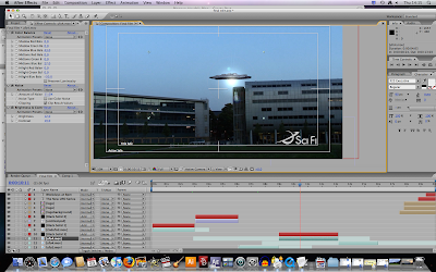
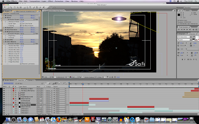
The Effects I used to blend the materiel created in maya are mixture of colour correction tools, lens blurs and noise. This was probably the most difficult part of the project, trying to make 3D models look authentic when placed over HD footage. After doing this I created a lens flair by creating a new black solid and selecting the add mode. The scenes where the UFOs travel behind a building are simply masked out this was also rather difficult if the camera zooms out because the mask needs to be constantly moved
Ident; Final Footage
After realizing much of my original footage had to much shake on it to edit successfully I decided to re-shoot much of it. I struggled with trying to get many of the original shots with a tripod so many of the scenes vary from the first footage.
Maya UFO
After creating my UFO's I animated them in a simplistic way that would work my footage. This technique was repeated for the rest of the scenes.
UFO Creation - Maya
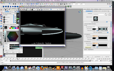
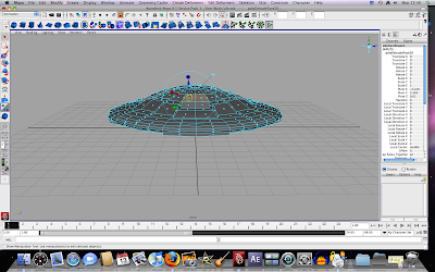
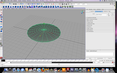
My knowledge of Maya was pretty much none existant before creating this UFO, I will admit I still find it difficult as it is not what I'm used to. On the other hand this project and my decision to create UFO's in Maya has given me the basic understanding of extruding shapes and rendering, these are aspects that unfortunately I was unwilling to give the time of day in last years animation project.
Thursday, 16 October 2008
Example of poor motion tracking and masking
I spent hours today messing about with motion and tracking. For some reason it hasn't worked as well as the footage edited yesterday. This is probably because there is far too much camera shake on this bit of footage. The masking was done after, it's fairly poor I know but I decided not to spend much time on this as it is obviously not going to be used in my final film. This means I will have to re-shoot a lot of my footage, it's probably best film on a tripod or with minimal movement.
Wednesday, 15 October 2008
Motion Tracking In After Effects
I watched a tutorial on creativecow.com which showed me how to motion track. I then applied this process to my background footage. It makes the 3D model move as the camera does or at least it appears that way. After doing this I added some finishing touches to the colour of my UFO by using the curve tool, finally adding a noise filter to my 3D model to give it a film grain effect. It almost looked complete however the space ship appears to be moving much faster at the start of the footage. I decided to solve this by taking the whole film back in to Final Cut and slow the speed of it down. When slowing the film down I became aware of the reverse tool in the speed options, sampling it I decided that the footage looked a lot more convincing in reverse.
Visual Effects and Motion Graphics - Original Final Cut
This is my original cut, most probably how my final footage will be. This depends on whether or not I can master motion tracking and use it with this this sketchy footage to get some realistic results. Another factor would be if we are now able to take cameras out over night. I want to get some evening or dawn shots as I only have one and it's incredibly short, this is a shame because it is in this shot that the sky has the best lighting. Too much camera shake meant that the majority of this footage was useless. This is something I must keep in mind for filming in the the future.
Visual Effects and Motion Graphics - UFO Footage 2nd attempt
This was my second attempt at putting maya material into camera footage. This time I used the camera in maya to follow the spaceship as it moved in a similar way to how the camera moved in the footage. This gave a better perspective of the UFO making its movement seem much more realistic. In After Effects I added a mask in front of the tree to give the effect that the UFO comes out from behind the tree. I quite like this idea as it is simple to do and it makes the whole film look more realistic. The thing that is most noticeable with this film is the camera shake but the UFO does not move with. I need to learn about motion tracking.
Visual Effects and motion Graphics - First UFO footage
This is the first UFO footage created yesterday. It looks rather ridiculous I know. I think I will be able to get better results by doing the following; Panning the camera in maya so it moves in a similar fashion to that of my footage. That should give the viewer the feeling that both the UFO and the footage have the same perspective. I need to learn about motion tracking as well, this will make the footage more realistic too as hopefully it will cause the UFO to move if the camera shakes. Finally the lighting and blending effects will be what determine how realistic these UFO's look. At the moment it is clear that this has just been stuck on over the top of the film. I need to find a way of making my maya content have a film grain on it as this will stop it from looking so fake.
Visual Effects and motion Graphics - First Edit
This is my first edit of the footage i shot last Friday. Much of it is fairly crap to be honest, it has far too much camera shake and movement therefore it will make motion tracking rather difficult when it comes to making my UFO's look authentically placed in the footage. Next I plan to put one of my UFO's in some of the footage. This will give me a good idea of how easily I can make some of this UFO footage look realistic.
Monday, 13 October 2008
Ident problem
Sci Fi channel Ident
Another example of how the logo and overall layout of the sci fi channel's idents vary. This is also a good example of how text can be layerd over moving image and how different bits of film can be edited together changing smothly fom scene to scene.
Sci fi channel ident
Again found on dailymotion.com in this ident the logo appears differntly. Infact in all of the Sci Fi channel idents i have analyzed the way the logo appears is different everytime. I found this rather strange as this seems to be a continuity issue. Ok so there not intirely different the still use the same logo and colour schemes. However i expected it to be the same or incredibly similar to show brand ident like channel 4 for example. Never the less this promo for battlestar gallactica has some nice space ship scenes, one in particular about 10 seconds in. The UFO's are rather small and hard to make out any particular detail. This is probably the best thing for me to do to avoid making my content look cheap and poorly produced.
Sci fi channel ident
I found this sci fi ident on dailymotion.com. I wanted to find out how the sci fi logo appeared on the screen at the end of the ident. A couple of things I have noticed are the way the sky has been edited to make the image more sci fi orientated. Finally the way the purple and black fades in before the logo appears. This has been done in after effects although I'm not exactly shore how.
Zeitgeist
dramatically. I know it is quite an intense viewing but if you manage to break it down it becomes clear that our intire civilisation is built upon lies, plagiarism and intimidation. The question is now, what are you going to do about it?
Sunday, 12 October 2008
Location Animatic
Seen as my original animatic didn't have any specific scenes outlined I decided it was best to scope out some potential location shots before filming.
Saturday, 11 October 2008
Post final crit analysis
After Thursday's final crit it has become much clearer to me what is expected in a final crit session. Before this i was under the illusion that final crits were used purely as expression of my final idea eg storyboard or animatic. It was explained in Thursday's final crit that that all work produced up until this date should be displayed showing how and why i reached my final idea. The best explanation for this used by one of my tutors which is to imagine that the group is a company that the idea is being pitched to and that they are completely clueless as to what I am wanting to do.
Thursday, 9 October 2008
Sci fi Ident Animatic
This animatic is more of a working preview of how the final thing mite look had I created my own footage. These images are simply high quality photographs found on the internet edited in photoshop with ufo's super imposed over the top of the background. I also experimented with moving image at the end of the ident, the full version of this film is available in a previous post. As you mite have gathered this Ident is designed in a cliche X-files style eg the type and the sound track. Some of the critism recieved in todays final crit consisted of using either photographic images or moving image, putting the type over the footage or photo, maybe changing the font and changing the typewriter sound to a keyboard clicking while making sure that the ident fits into the allocateted slot. This isn't really an issue as it can easily be put right when producing my own footage.
Thursday, 2 October 2008
Green Screen
Using some of the footage filmed in front of a green screen by one of the 3rd years we were taught how to erase the green. It was amazing to see just how simple this process is. Finally to make it more interesting I inserted one of the kaleidoscope films made earlier as the background.
Kaleidascope; created using the cc kalieda filter
This was created rather easily using a simple kaleidoscopic filter, simply adjusting a few of the settings over the time line. This gives some hypnotic visuals that are often used for big screens in clubs and would be useful VDJing.
Subscribe to:
Comments (Atom)

