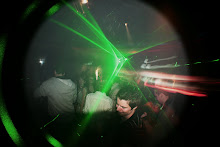
In general this piece sums up my hobbies, interests and a small amount of biographical information, therefore I would say it meets the requirements of the brief. I used a good range of imagery, three of the images I used I took myself and the other three I downloaded from the Internet. I expressed concern in my rationale about using imagery from the Internet as they are of a low resolution, however in the end it was some of the images I took myself which let the whole thing down. One image (the club scene) I took using a digital SLR so this is good quality image but the decks and plughole were taken with a point and shoot camera so unfortunately they’re not to my satisfaction.
I decided to go less political than first anticipated with the word “Capitalist” scribbled across the globe in a type face which is not that legible, this shows that this part of me is quite hidden yet still exists. The biographical information I included refers to the left of the image with my star sign logo, “Capricorn” and the symbol of my Zodiac sign, which is the earth dragon. I didn’t mention this in my rationale but I find myself often reading my star sign even though I wouldn’t think of myself as superstitious I decided it would be a good idea to include it in my design.
If I had the chance to do this again I would have taken better quality images and made more use of the negative space. I liked what my classmates had to say about my work and I agree with their light criticism. I must say in reply to one of the comments, I would have used some more professional turntables but these are what I use and I believe it’s not always what you use but how you use it.
Subscribe to:
Post Comments (Atom)
No comments:
Post a Comment